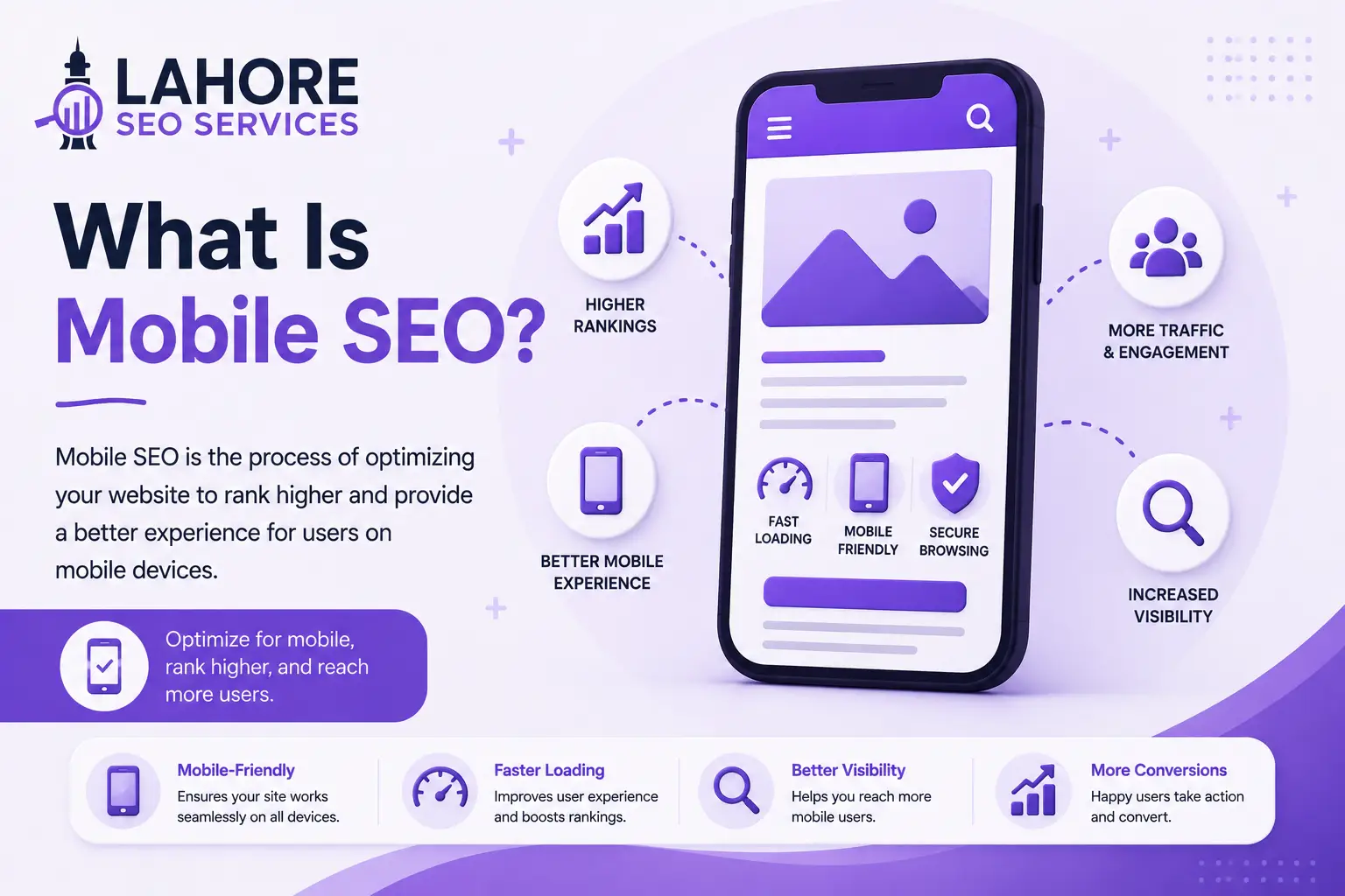
Mobile SEO is the process of optimizing your website so search engines can crawl, index, and rank your pages effectively while users receive a fast, usable experience on smartphones and tablets. Mobile SEO optimization covers responsive design, page speed, mobile content, navigation, technical SEO, search intent, and page experience.
For a business targeting customers through Google, mobile SEO is not a separate replacement for search engine optimization (SEO). Mobile SEO extends core SEO practices to the conditions created by smaller screens, touch navigation, mobile connectivity, device capabilities, and location-aware searches. Google’s current guidance emphasizes overall page experience, including mobile display, Core Web Vitals, HTTPS, and avoidance of intrusive interstitials.
What Is Mobile SEO?
Mobile SEO focuses on making a website accessible, understandable, fast, and useful on mobile devices. A mobile-optimized page should display correctly at different screen sizes, expose important content and links, support easy interaction, and maintain the technical signals required for search engines.
Google uses the mobile version of a site for indexing and ranking under mobile-first indexing. Therefore, your mobile pages should contain the same essential content, structured data, metadata, images, and important links that support the desktop version.
Why Is Mobile SEO Important?
Mobile SEO is important because search visibility and user experience depend on how effectively your website works on mobile devices. A technically strong desktop page can still create friction when menus are difficult to use, content extends beyond the viewport, or important elements load slowly.
Google evaluates page experience across multiple dimensions rather than relying on one isolated signal. Google specifically recommends checking Core Web Vitals, secure delivery, mobile display, intrusive interstitials, and whether the main content remains easy to distinguish.
Mobile SEO also affects local SEO and local discovery. Mobile users frequently search for services, businesses, products, directions, and nearby options. Location can therefore influence the search engine results pages (SERPs) shown to a mobile user, especially for local-intent queries.
Mobile SEO vs Desktop SEO
Mobile SEO and desktop SEO share the same fundamental objective: help search engines understand relevant pages and help users complete their search tasks. The difference comes from device constraints and the way users interact with results and pages.
Mobile SERPs can present search features differently because the screen has less horizontal space. Organic search results may appear alongside or beneath features such as local results, images, videos, or other search features. A mobile SEO strategy must therefore consider how titles, descriptions, structured data, and page content support search visibility within a compact interface.

Mobile-First Indexing
Mobile-first indexing means Google primarily uses the mobile version of website content for indexing and ranking. Google does not maintain a separate mobile ranking system simply because a person uses a phone; the critical issue is whether Google can access and understand the mobile version.
Your mobile version should therefore contain the same primary content as the desktop version. Keep important headings, text, images, links, structured data, metadata, and other search-relevant elements consistent across versions.
Separate mobile URLs require extra technical care because differences between mobile and desktop HTML can affect discovery and indexing. Responsive design usually reduces this complexity because one URL serves the same page across device sizes.
Responsive Web Design
Responsive design allows a website layout to adapt to different viewport widths without creating separate pages for each device. A responsive implementation uses flexible layouts, appropriately sized media, and CSS rules that adjust presentation according to available screen space.
Responsive design does not automatically guarantee strong mobile SEO. A responsive page can still contain excessive scripts, weak internal links, intrusive pop-ups, or difficult navigation. Technical testing remains necessary after responsive implementation.
Mobile SEO Optimization for Site Speed
Site speed is a core part of mobile SEO optimization because mobile devices can operate under different network and hardware conditions. Large images, unnecessary JavaScript, render-blocking resources, third-party scripts, and inefficient server responses can delay page rendering.
Focus on Core Web Vitals rather than chasing an arbitrary universal loading-time number. Optimize image dimensions and formats, reduce unnecessary code, defer noncritical resources, and improve server response performance.
A faster page should preserve functionality. Removing essential scripts or features merely to obtain a higher laboratory score can damage usability. Test performance changes on real mobile layouts and verify that navigation, forms, menus, tracking, and conversion elements continue to work.
Mobile-Friendly Content Structure
Mobile content needs a clear hierarchy because a narrow screen makes dense blocks harder to scan. Use descriptive headings, short paragraphs, meaningful lists, and concise introductory sentences where each section answers a specific question.
Place important information where users can reach it without excessive scrolling or repeated expansion. Use descriptive anchor text for internal links and ensure important service, category, and contact pages remain easy to access.
Title Tags and Meta Descriptions
Title tags and meta descriptions should accurately represent the page on mobile and desktop search results. Mobile SERPs have limited screen space, so front-load the main topic and remove unnecessary wording.
A useful title should identify the page subject clearly, while a useful meta description should summarize the page and support an accurate expectation before the click.
Mobile Keyword Research
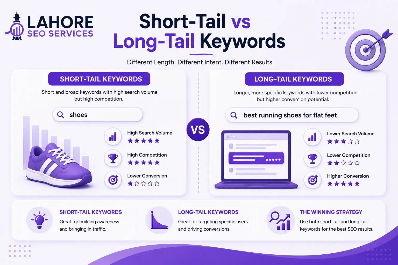
Mobile keyword research identifies the queries and search contexts relevant to people using mobile devices. Start with your core topics, then examine location modifiers, conversational phrases, service terms, product searches, and long-tail keywords that match actual customer needs.
For local businesses, mobile keyword research should consider phrases such as “near me,” city names, neighborhoods, service areas, directions, opening hours, and contact intent. The appropriate terms depend on the actual audience and business model.
Navigation and Internal Links
Mobile navigation should expose important website sections without requiring complex interactions. Use a clear menu structure, visible calls to action, and descriptive internal links.
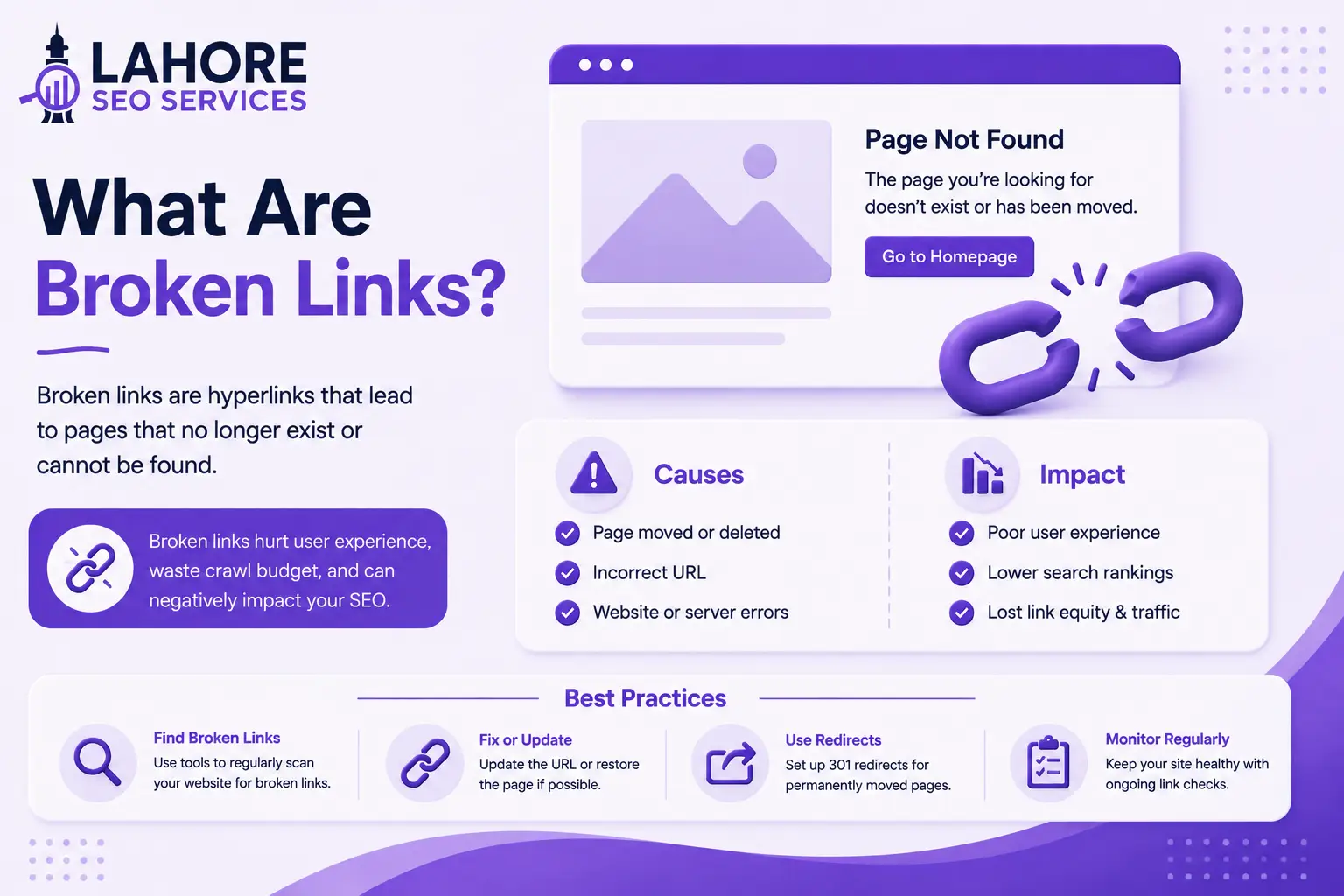
Do not hide essential links exclusively behind interface elements that make discovery difficult for users or search engines. Google has specifically highlighted the importance of ensuring links present on desktop are available on mobile versions for large sites using separate mobile HTML.
Internal links should connect related pages based on topic and user intent, forming an important part of on-page SEO. A service page can link to relevant supporting guides, while a blog article can connect naturally to a relevant service page. Strong internal linking helps users and search engines understand site relationships.

Mobile Pop-Ups and Interstitials
Mobile pop-ups should support the user’s task without obstructing the main content. Large interstitials that cover the primary content can create a poor page experience, especially when a user must dismiss an overlay before reading the page.
Use banners, notices, or compact prompts when those formats communicate the same information without blocking essential content. Keep close controls visible and functional on small screens.
Technical Mobile SEO Checklist
A practical mobile SEO audit should examine the complete path from crawling to conversion. Check the following areas:
- Responsive layout across common viewport sizes
- Mobile-first content and metadata parity
- HTTPS and secure resource loading
- Core Web Vitals and page performance
- Crawlable internal links
- Accurate XML sitemap
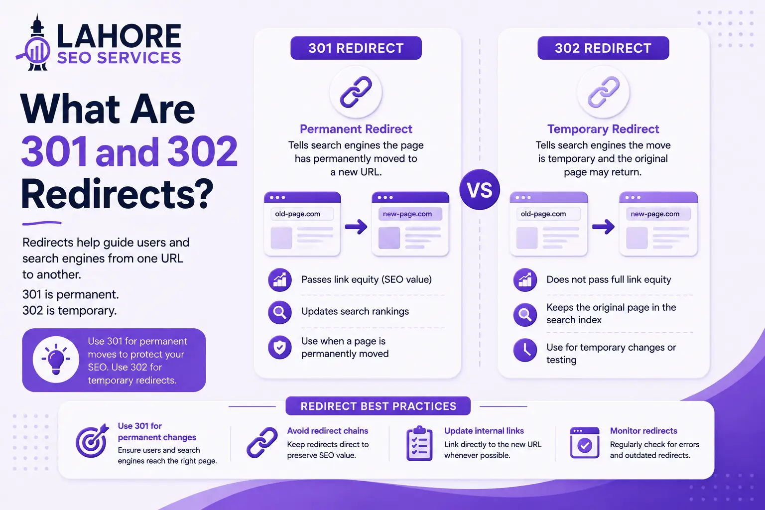
- Correct canonical and robots directives
- No accidental noindex tags
- Readable text and clear headings
- Touch-friendly buttons and links
- Proper image sizing and responsive media
- Functional forms, menus, and search
- Non-intrusive pop-ups
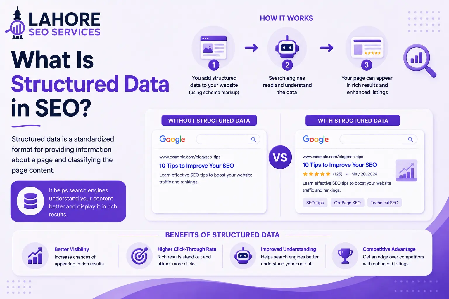
- Consistent structured data
For ecommerce websites, mobile optimization must cover product discovery, filters, product images, variant selection, cart controls, checkout fields, payment steps, and trust information. For service websites, prioritize calls, enquiry forms, location details, pricing information, and appointment actions without unnecessary mobile friction.
Use Google Search Console to identify indexing and search-performance issues, then use PageSpeed Insights and browser testing to investigate performance and rendering problems.
Mobile SEO Testing Tools
Mobile SEO testing should combine search-engine data with direct browser testing. Google Search Console helps you inspect indexing, search queries, pages, and technical signals. PageSpeed Insights evaluates performance and provides diagnostics for mobile and desktop experiences.
Test important templates rather than checking only the homepage. Review service pages, product pages, category pages, blog articles, contact forms, and checkout paths where relevant.
Common Mobile SEO Problems
Common mobile SEO problems include slow pages, poor responsive layouts, blocked resources, missing mobile content, difficult navigation, intrusive interstitials, oversized images, broken forms, and inconsistent structured data.
Prioritize problems by impact on accessibility, indexability, usability, and conversions. Fix systemic template issues before making isolated changes to individual pages.
How to Build a Mobile SEO Strategy
To build a mobile SEO strategy, start with a technical baseline, identify important mobile search journeys, and map improvements to measurable outcomes. Review organic visibility, indexed URLs, Core Web Vitals, mobile layouts, internal linking, and conversion paths.
Next, resolve technical barriers. Make important content accessible, maintain consistent mobile and desktop information, improve performance, and simplify navigation.
Then optimize page-level elements such as titles, headings, content structure, images, internal links, and structured data. Align each page with a distinct search intent rather than producing multiple URLs for closely related queries.
Finally, monitor Search Console performance, organic clicks, impressions, indexed pages, conversions, and page-experience data.

How Lahore SEO Services Can Help
A professional SEO process can integrate mobile SEO with technical SEO, content optimization, local search, internal linking, and performance work. Lahore SEO Services can evaluate mobile templates, identify crawl and indexing barriers, review page experience, optimize content structure, and align important pages with relevant search intent.
The objective is not simply to make a website look good on a phone. Your mobile website must remain accessible to search engines, useful to visitors, technically consistent, and capable of supporting business actions such as calls, enquiries, purchases, bookings, or form submissions.
Conclusion
Mobile SEO is the practice of optimizing your website for mobile accessibility, search visibility, technical performance, and user experience. Strong mobile SEO combines responsive design, mobile-first content parity, efficient performance, clear navigation, useful content, technical accessibility, and accurate page-level optimization.
A complete mobile SEO guide should therefore cover more than screen size. You need to evaluate crawling, indexing, ranking, Core Web Vitals, internal links, content, metadata, structured data, forms, pop-ups, and conversion paths.
When you treat mobile optimization as part of your complete SEO system, your website can provide a more consistent experience across devices while supporting stronger technical foundations for organic search.
Frequently Asked Questions
What is mobile SEO optimization?
Mobile SEO optimization is the process of improving a website for mobile search visibility and usability. The process includes responsive design, performance optimization, mobile content parity, accessible navigation, technical SEO, readable layouts, touch-friendly controls, and accurate metadata for search engines.
Why is mobile SEO important for websites?
Mobile SEO is important because Google uses mobile content for indexing and ranking, while users increasingly access websites through mobile devices. A strong mobile experience helps maintain accessibility, usability, performance, and search visibility across smartphones and tablets.
How to optimize a website for mobile SEO?
To optimize a website for mobile SEO, use responsive design, preserve essential mobile content, improve Core Web Vitals, simplify navigation, optimize images, maintain crawlable links, remove accidental noindex directives, and test important templates across real mobile devices.
What are the key mobile SEO best practices?
Key mobile SEO best practices include responsive design, mobile content parity, fast performance, readable typography, touch-friendly controls, clear navigation, secure HTTPS delivery, accessible internal links, accurate metadata, useful structured data, and non-intrusive interstitials that do not block main content.
What should a complete mobile SEO guide include?
A complete mobile SEO guide should include mobile-first indexing, responsive design, crawling, indexing, page speed, Core Web Vitals, content optimization, keyword research, internal linking, metadata, structured data, technical testing, usability, local search, and ongoing performance monitoring.